Logos, Letterheads, & Illustrations.
1) Logos
A logo is a symbol or design used to identify a company or organization, as well as its products, services, employees, etc.
In its simplest definition, a logo identifies. It’s how your company is recognized and remembered among others. It also functions as the face of your business.
Your logo can also be an opportunity to make a statement about your organization.

5 Phases:
- Discovery
Designers use this time to obtain as much context and background as possible to fully understand the client’s company or organization, its values, business, brand attributes.
- Exploration
Different colors evoke different emotions and behaviours, helping one to create the desired emotional response from the audience.
- Design
All the considerations and inputs from the first two phases are taken and some logo alternatives are generated.
- Refinement
A great logo is Simple, Memorable & Evocative
It is used on your website or social media profiles—as well as your secondary use cases, like printed marketing materials, recruitment and event banners, etc.
Any logo mark should be effective at many sizes, but small, digital applications are critical.
- Exactitude
When it comes to maintaining the integrity of your brand identity, quality and consistency are key. Given the number of places your logo will live getting it absolutely right is key.
Drawing a Logo can take 10 mins. Deriving it can take 3 hours !
Our Logos start from £125
2) Letterheads
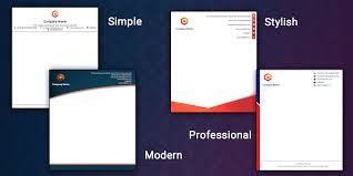
A potent letterhead can make all the difference to the success of your branding.
There’s a huge difference between receiving a letter on standard blank paper, and getting one topped with a beautifully designed letterhead. A letterhead acts as an opportunity, for brand engagement and lend credibility to the words on the page.

Sometimes your letterhead design will be the first interaction a customer has had with a particular company, while other times it will be used to reinforce the brand identity. It’s crucial to get the details right, but to also produce something that’s eye-catching, and memorable.
One of the most important principles behind an effective letterhead is to keep the design as simple as possible. Keep in mind that a letterhead is essentially a delivery mechanism. It’s important your letterhead looks and feels great in the hand, but the design should make way for the content of the letter that’s printed over it.
The company’s branding must be clear on the letterhead. This isn’t just about the logo, but the choice of colour scheme, font(s), imagery, and much more.
Equally important is to use the correct font – Helvetica won’t do if the corporate font should be Times Roman.
3) Artwork for Websites
A picture paints a thousand words.
And gives you a hand that won’t be forgotton.

That is why we recommend customised drawings or altered photographs to reinforce and blend with the message your website delivers.
Ask anyone who works in the art department of an Ad Agency how and why customised artwork helps bring a standard website to new heights that elicit the response you need.

|
|
||
|
Customised
|
V |
Off the Shelf |
|
Reinforces the website message perfectly
|
Hard to find something just right for the message
|
|
|
Provides the website a sense of uniqueness and something special
|
Bland and ordinary Nothing to make the website stand out |
|
|
Used by professional ad men to elicit beneficial psychological responses such as empathy.
|
Gives the website an amateur feel which reflects on the company. |
|
|
Can Reinforce your Company Brand positively.
|
Misapplied can adversly affect your brand by associating it with cheap production.
|
|
|
Memorable by creative design.
|
Forgotton Easily by blandness. |
|
It is easy to see an architect’s website against a simple designer’s one, by the latter’s lack of knowledge of the importance and application of artistic creative reinforcement.
