Solicitors
How does a prospective client choose the firm of solicitors they decide to instruct ?
It isn’t through skills and expertise because all law firms claim they have these. It isn’t the biographies of the people involved. The exceptions are individuals who are at the top of their game. In that case they are appealing to deep pocketed clients and it’s obvious how their site should be contructed and what the central message should be.
Six main criteria for the 99% remainder of law firms.
Prospective clients choose on the basis of:
- Personal Recommendations
- The Image or Brand of the practice
- Their Web site – In particular the main message and how it is delivered
- Their Track Record in the select area
- How skilled they are at negotiating (where applicable)
- How personable they are (very important)
And not necessarily in that order.
Not all criteria apply in every case. For example with some prospects a “brand” or an effective website may be enough. These two usually being key.
An Engaging embedded Video will communicate all the above in just a few minutes. It is engaging, provides all the information in a credible way and has triple the conversion rate of prospects to clients over a website without it.
Projecting the specialism, skills, credibility and personability all in 45 seconds of a memorable video for a very affordable price.
A Skilled web Architect will, through understanding your business, know what the central message should be (and there must be one). He will also know how to set a variety of other variables such as the coordination with the target audience(s), theme of the landing page (very important), what emphasis to put on what, and other subordinate messages. There is then the creative element in how to deliver the messages memorably. The actual design is also important but subordinate to the above items. And if budget allows to start installing a brand.
After reviewing numerous solicitor websites 1 in 100 have been designed correctly.
Common errors are lack of strategy, broadshot approaches even for niches, incorrect or meaningless messages (eg: “we give a quality service and we listen”) too much clutter, inadequate client engagement, DIY copywriting, meaningless or vague imagery, and a host of other things.
This results in no competitive advantage over others. The idea is to get prospects to make a phone call and then make an appointment, not overwhelm with information you can explain at a meeting. The key is correct balance of the important variables.
This website has a lot of information on it but in this case we know, as solicitors and professionals, you will engage this site differently, take notice and check what we are telling you to be very important.
We know law is your field and not web design so you wouldn’t know the difference from good, bad or indifferent web structures. However in today’s day and age, 75% of visitors to your site will judge you on your website alone. And this is regardless of how good you are at what you do. They will never find out if they don’t see you.
If you direct people to your web site make sure you are judged how you need to be, get competitive advantage and more opportunities to have that first meeting.
There are many ways to do this.

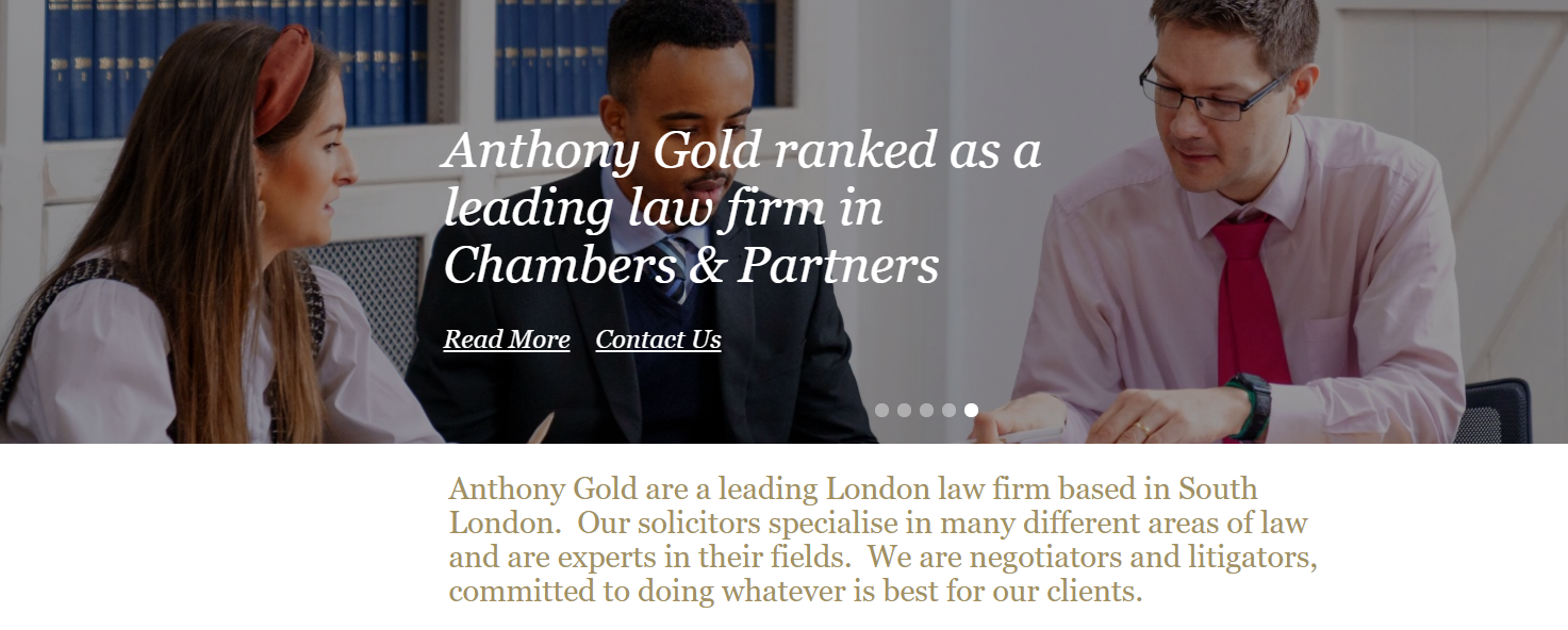
https://www.anthonygold.co.uk/
The central message on the landing page is the last sentence giving confidence that the firm are not just lawyers.
Following that each solicitor in the field they are in, delivers a sub message which is personable and empathic, and exactly what a prospective client wants to hear.
That is a key element. The relevant solicitor’s main attributes are summed up and the copywriting is engaging. The rest is supportive and succinct, focusing on how relevantly different and brilliant that lawyer is in so many different ways. The way it is written does not come over as egotistical but belivable. Proving how important copywriting is.
These solicitors may not be any better than you but the way the website works, and the way it draws in the prospect, if you were a client shortlisting solicitors, who would you pick ?
Doing it properly can return thousands of times what was invested in a strategically planned website.
Most solicitors do not have them.
That is why this is an opportunity.
The next step is to go to:
https://provencontacts.com/free-reviewyour-website/
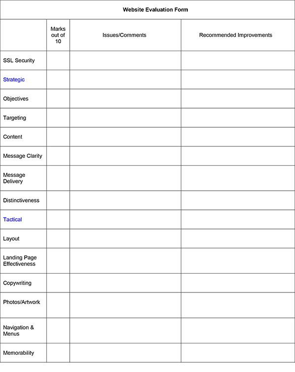
And we will evaluate your website individually and strategically using 13 different criteria (with reasons for each evaluation) free.
